Have you ever wondered what Roblox looked like before you started playing? Believe it or not, the old Roblox logo was once a rainbow of colors! When the platform first started, the creators wanted it to look fun and exciting for everyone. It has gone through so many changes over the last twenty years. Each new look tells a story about how the game was growing up.
Looking back at these designs is like looking through a time machine. You can see how the simple blocks we love today started as wiggly, colorful letters. In this article, we will walk through every single version of the old Roblox logo. We will see how it went from bright red outlines to the sleek, modern square we see on our screens today. It is a super cool trip down memory lane for any fan!
The Very First Roblox Logo (2004)
Back in 2004, Roblox wasn’t even called Roblox yet! For a very short time, it was known as DynaBlocks. The very first old Roblox logo featured many different colors like green, blue, and red. It looked a lot like the Google logo because every letter was a different shade. This was meant to show that the game was all about being creative and having a lot of different things to do.
However, the creators realized that “DynaBlocks” was a bit hard to remember. They soon changed the name to Roblox, which is a mix of the words “Robots” and “Blocks.” Even after the name change, they kept the colorful letters for a few months. It was a very cheerful start for a game that would eventually become famous all over the whole wide world.
The Red Outline Era (2005)
In 2005, the old Roblox logo got its first big makeover. The designers moved away from the rainbow colors and chose a bold red and white look. This version had thick red outlines around white letters. It also had a little line over the first “o.” Do you know why? That little mark was there to tell people how to say the name correctly! It showed that the “o” is a long sound, like in the word “robot.”
This red design felt much more like a real brand. It was strong and easy to see on a computer screen. This was also the time when the game started to move out of its testing phase. Many players who were there at the very beginning remember this logo fondly. It stayed around for a while as the game started to get more popular with kids everywhere.
The Graffiti Style Design (2006)
When Roblox officially launched to the public in 2006, it brought a “sassy” new look. This old Roblox logo looked almost like graffiti you might see on a wall. The letters were chunky and looked like they were drawn by hand. It still used the red and white colors, but the shapes were much more playful and bouncy. It felt like a true playground for your imagination.
This version is very famous because it lasted for several years. It was the face of Roblox during the years when classic games like “Work at a Pizza Place” were just starting out. Many “OG” players think of this as the “classic” logo. It represented a time when the community was small, and everyone was just starting to learn how to build their own 3D worlds.
The Transition to 3D Effects (2010)
As technology got better, the old Roblox logo changed again in 2010. The company wanted the letters to look like they were popping off the screen. They added gradients, which are colors that fade from light to dark. This made the red outlines look shiny and 3D. It matched the way the games were starting to look better and more detailed than ever before.
This logo was used during a huge growth spurt for the platform. During this time, millions of new players joined the fun. The 3D effect made the brand feel modern for its time. Even though it was still red and white, it felt much more “pro” than the earlier versions. It showed that Roblox was ready to become a giant in the gaming world.
The Birth of the Iconic “Cheezit” Square (2017)
The year 2017 brought the most famous change in the history of the old Roblox logo. The company decided to get rid of the red color entirely! They switched to a clean black-and-white design. The most special part was the first letter “O.” Instead of a circle, it became a tilted square with a hole in the middle. Fans joked that it looked like a silver square or even a “Cheezit” cracker!
This square was very important because it represented the building blocks used in the game. It was simple, clean, and looked great on mobile phones and tablets. This change signaled that Roblox was becoming a more “mature” platform for creators of all ages. While some fans missed the red, most people grew to love the new, sharp look of the tilted square.Comparison of Roblox Logos Over Time
Refining the Modern Look (2022)
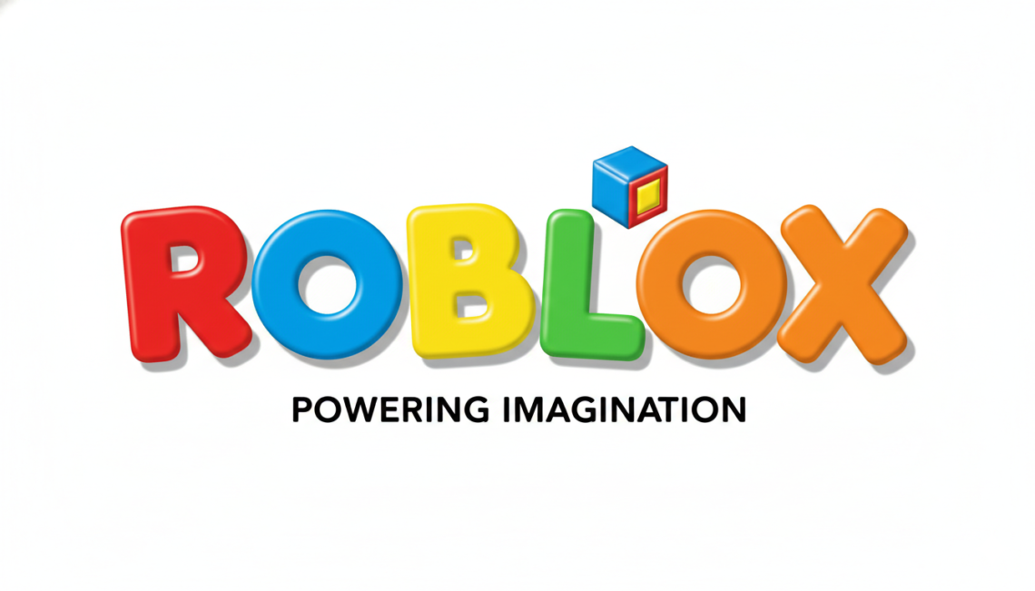
In 2022, the logo was polished once again. The “Cheezit” square stayed, but the other letters were changed to a new, custom font. The lines became a little thinner and cleaner. This made the old Roblox logo (from just a few years ago) look a bit bulky by comparison. The goal was to make the name easy to read on any size screen, from a giant TV to a tiny phone.
This version felt very sleek. By this point, Roblox wasn’t just a game for little kids anymore. It was a place where people held concerts and famous brands opened virtual stores. The simplified logo helped the brand fit in with other big tech companies. It proved that sometimes, less is more when you want to look professional and cool at the same time.
Why Does the Logo Keep Changing?
You might wonder why they don’t just pick one and stick with it. Well, companies change their look to keep up with the times! Just like you might change your style as you get older, the old Roblox logo changed to reflect the spirit of the players. When the game was a small hobby, the logo was playful and messy. As it became a global platform, it became sharper and more focused.
Changing the logo also helps people notice when something new and big is happening. For example, the shift to the square “O” helped everyone see that Roblox was a serious place for building and creating. It’s all about “Powering Imagination.” Every time the logo gets an update, it’s like the company is saying, “We are ready for the next big adventure!”
Fun Facts About the Roblox Symbol
Did you know the tilted square has a special name? Many people inside the company call it the “Bloblox.” Another fun fact is that the tilt of the square is exactly at a specific angle to represent movement. The old Roblox logo versions often included a slogan underneath, like “Powering Imagination.” However, the newest versions usually stand alone because the symbol is so famous now.
Another cool secret is that the “O” looks like a gear. In the early days, gears were a big part of the game. You could buy gears to use in different worlds. Even though gears aren’t as common now, the logo still honors that history. It’s a tiny tribute to the “old days” of the platform hidden right in plain sight for everyone to see!
The Meaning Behind the Colors
The colors used in the old Roblox logo were never chosen by accident. Red was used for a long time because it stands for energy, passion, and excitement. It made the game feel like a fast-paced place to play. When they switched to black and white, they wanted to show that the platform was a “blank canvas.” This means that you, the player, provide the color with your own creations!
Recently, in 2025, a blue version appeared. Blue is a color that makes people feel safe and calm. It’s often used by technology companies to show that they are reliable. Even though we’ve seen red, black, and blue, the core heart of the logo remains the same. It is always about the blocks and the people who use them to build amazing things every day.
How Fans React to Logo Changes
Whenever a new logo comes out, the internet goes crazy! Some fans love the new look right away. Others might miss the old Roblox logo and make memes about how much they want it back. This shows just how much people care about the game. It isn’t just a piece of software; it’s a place where people have grown up and made friends.
Over time, even the people who complained usually start to like the new version. It becomes the new “normal” until the next update happens. Seeing the evolution of the logo helps us appreciate how far the platform has come. From a tiny project in a basement to a world-wide phenomenon, the logo has been there for every single step of the journey.
Conclusion: A Legacy of Blocks
The story of the old Roblox logo is truly a story of growth. It started with simple, colorful blocks and turned into a symbol that millions of people recognize instantly. Whether you prefer the classic red graffiti or the modern silver square, every version represents a different era of fun. It’s amazing to think about how much has changed since those first rainbow letters in 2004!
Roblox will likely continue to evolve as we move into the future. Who knows what the logo will look like in another ten years? One thing is for sure: the spirit of creativity and building will always be at its center. What is your favorite version of the logo? Let your friends know and keep on building your dreams!
Frequently Asked Questions
1. What was the very first name of Roblox? Before it was officially Roblox, the platform was briefly called DynaBlocks during its early development in 2004.
2. Why is the “O” in the Roblox logo a square? The square “O” represents the building blocks that are the core of the game. It also looks like a gear, which was a classic item in the game.
3. When did Roblox stop using the red logo? Roblox moved away from the red and white “graffiti” style logo in early 2017 when they introduced the black-and-white square design.
4. What does the accent mark over the “o” mean? In the old Roblox logo from 2005, the accent mark was used to show that the name is pronounced with a long “O” sound.
5. Is there a blue Roblox logo now? Yes! In early 2025, Roblox introduced a blue version of the logo to represent trust, stability, and a modern tech feel.